by Jay Hinton and Sean Jacobs
Summary: While user interface (UI) color choices may seem arbitrary or tied to individual preferences, an emerging trend seems to reveal that color does matter for a number of cognitive and physiological reasons. The end result is an improved user experience (UX) for investment professionals working long hours under stressful market conditions.
Examining software products on the desktops of traders and portfolio managers, one quickly notices that they tend to come in two colors: black, and white. In truth, there’s usually a host of other colors within the platforms, but the backgrounds and negative space are almost exclusively either a dark color “black” or a light color “white.” Why is that? Or more specifically:
- Why aren’t they all the same—why do users prefer to have multiple “looks” on the screen?
- Why is dark the dominant theme in execution and portfolio management systems?
- Does the actual color (dark vs. light) matter?
The Important of Multiple Looks
Why does color matter? Color, or more accurately a differentiation of color, helps in orientation; that is, helping the user to make sense of their workspace. In the best of times, a modern trader’s desktop may extend across four or more monitors, over 1,500 square inches of space, and contain a dozen different applications, all competing for attention, mental space and cognitive resources.
In the current situation, investment professionals may be forced to work from home in the middle of epic market volatility, down to two (or even one) monitor, attempting to transition between applications and rapidly prioritize certain operations while managing multiple orders and asset classes. To the degree that the applications look different, traders and portfolio managers can quickly and smoothly move between business functions and workflows in the appropriate context.
Hick’s law suggests that as the number of choices a user needs to make increases, the longer it takes them to make the selection. Applications that present differently add more information, increasing decision speed—particularly important in a time-sensitive environment like a trading desk. Similarly a trader must navigate and differentiate order management actions and tasks that while important, are usually not as risk- or cost-impactful as those performed in execution management.
The law of common region notes that elements will be perceived together as a group if they share an area with a clearly defined boundary. A dark color theme can effectively provide this boundary in the context of an execution management system (EMS), so that a trader can innately understand that actions they take within this dark boundary will carry market impact and risk.
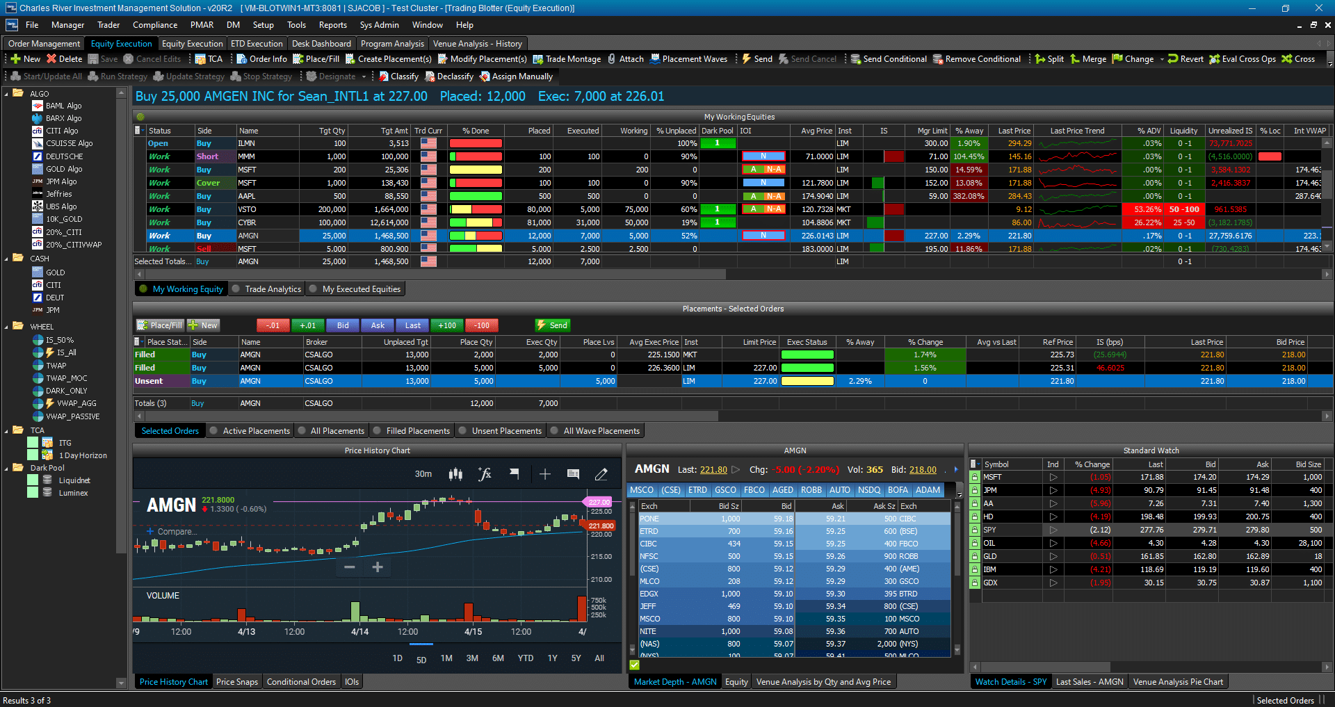
Screenshots for informative purposes only; no live data being used.
The EMS landscape
The EMS landscape is dominated by dark user interfaces (UIs). Given how traders will use an EMS and the visualization and data demands they require to perform their job, this theme choice is appropriate. However, regardless of what the research tells us (we’ll explore that question at the end), does it even matter if a dark theme is the ideal palette for an EMS, when competing technologies are already dark? It’s difficult to say with certainty which EMS was the first to go dark. What can be said is that somewhere between 2000 and 2010, dark became the standard. And we know from Jakob’s Law that a product exists in the context of all the other products a user encounters—which is very true in a space like EMS applications, where there are a limited number of comparable products. So once a standard develops, de facto or du jour, competitors follow.
One interesting aspect of this arena is the need to separate salability from usability. The sales process, and elements that aid in a sale, are often in diametric opposition to what makes a product easy to use. Products that sell well are splashy, active, and often are novel or memorable. In a sales process driven by product demonstrations, it is important to remember that an interface which is aesthetically pleasing will be perceived as easier to use. Products that use well, by contrast, may be almost dull in appearance, and seem to “just work,” hiding the effort that went into the design process. The latest move towards “flat” UIs is evidence of this trend.
Dark vs. Light – Does a color choice matter?
Because the EMS landscape is dark, it begs the question, “What color scheme is better – dark or light? Definitively, the answer is… it depends. When it comes to choosing the paint color for a brand new car, individual preference or opinion is likely to drive the selection. Unlike choosing a paint color, defining a color scheme for the visual foundation of a user interface is a much more complex decision. The decision must consider a number of well-researched factors centered on end users and how they will interact with the application. Let’s explore some of these factors:
Reading vs. Scanning
A light theme that presents black text on a white background is a safer design choice that offers the most readable UI. Not surprisingly, newspapers and magazines generally adhere to this color scheme. That the light theme survived the digital migration from printed hardcopies to online publication tells us that the color choice was not just made to save ink and reduce printing costs. A light theme is the logical design choice for a newspaper website, because black text on a light background improves reading speed and accuracy.
But, not all applications are created for displaying blocks of content. If a user’s primary goal is to quickly scan for information, a dark UI can improve performance by helping them comprehend information at a glance. The negative space in a dark theme absorbs light, allowing it to naturally recede into the background, while conversely emphasizing key data elements. As a data display increases in information density, a dark UI can further enhance comprehension.
Through this lens, a dark UI is a natural fit for an EMS where traders must quickly monitor and interpret dynamic market conditions in a dense blotter to identify orders most requiring their attention.
Data Visualization
Recently, many business intelligence software tools and other professional analytic applications have embraced a dark theme. Just as text can stand out against a receding dark background, colors and data visualizations are more salient on a dark theme. With this in mind, constructing a visual hierarchy to highlight elements requiring additional attention is easier with a dark theme. This is particularly relevant as EMS and portfolio management systems continue to focus on adding analytic capabilities.
Length of Use
While we already discussed the readability benefits of a light theme, one factor that can actually erode these benefits is how long a user must interact with an application. As users spend more time staring at a computer screen, eyestrain becomes a problem that detracts from their ability to focus on and use an application. A light UI with black text is especially fatiguing, whereas a dark theme has been shown to reduce eyestrain and improve readability. This is particularly true when users of an application are required to perform a job over multiple hours. If market exchanges closed for a lunch break perhaps traders could recharge their eyeballs at mid-day. But until then, traders are glued to their EMS screen for 7 or more market hours, and a dark theme can help them stay attentive and focused.
Perception
Beyond quantitative measures, a color theme choice also carries psychological implications for how users might perceive an application or UI. Black is a color known to convey power, formality, prestige and expertise. Retail brokerage firms take advantage of this perception by designing their Active Trader applications in a dark theme, so that these customers feel they have access to a more specialized and powerful tool. By extension, institutional traders carry these same perceptions and a dark theme within an EMS can help convey control and power when navigating a dynamic market environment. If you show a trader two EMS applications – one in a light theme and another in a dark theme – an instinctual perception that the dark EMS is a more powerful tool will quickly emerge, regardless of the comparative functionality offered.
Conclusion
We don’t know if the movement towards dark-themed UIs was a well thought out, research-based decision, or simply a matter of happenstance. But we now know the answer to the question: “What color scheme is better for front office systems – dark or light?” While designers may have an opinion on that question, the competitive landscape has already emphatically answered it. So with apologies to Henry Ford, a modern EMS comes in any paint color you want…as long as it’s black.
3075738.1.1.GBL.
Disclaimers and Important Risk Information
Charles River Development – A State Street Company is a wholly owned business of State Street Corporation (incorporated in Massachusetts).
This document and information herein (together, the “Content”) is subject to change without notice based on market and other conditions and may not reflect the views of State Street Corporation and its subsidiaries and affiliates (“State Street”). The Content is provided only for general informational, illustrative, and/or marketing purposes, or in connection with exploratory conversations; it does not take into account any client or prospects particular investment or other financial objectives or strategies, nor any client’s legal, regulatory, tax or accounting status, nor does it purport to be comprehensive or intended to replace the exercise of a client or prospects own careful independent review regarding any corresponding investment or other financial decision. The Content does not constitute investment research or legal, regulatory, investment, tax or accounting advice and is not an offer or solicitation to buy or sell securities or any other product, nor is it intended to constitute any binding contractual arrangement or commitment by State Street of any kind. The Content provided was prepared and obtained from sources believed to be reliable at the time of preparation, however it is provided “as-is” and State Street makes no guarantee, representation, or warranty of any kind including, without limitation, as to its accuracy, suitability, timeliness, merchantability, fitness for a particular purpose, non-infringement of third-party rights, or otherwise. State Street disclaims all liability, whether arising in contract, tort or otherwise, for any claims, losses, liabilities, damages (including direct, indirect, special or consequential), expenses or costs arising from or connected with the Content. The Content is not intended for retail clients or for distribution to, and may not be relied upon by, any person or entity in any jurisdiction or country where such distribution or use would be contrary to applicable law or regulation. The Content provided may contain certain statements that could be deemed forward-looking statements; any such statements or forecasted information are not guarantees or reliable indicators for future performance and actual results or developments may differ materially from those depicted or projected. Past performance is no guarantee of future results. No permission is granted to reprint, sell, copy, distribute, or modify the Content in any form or by any means without the prior written consent of State Street.
The offer or sale of any of these products and services in your jurisdiction is subject to the receipt by State Street of such internal and external approvals as it deems necessary in its sole discretion. Please contact your sales representative for further information.
©2020 STATE STREET CORPORATION